
UX/UI Design
Timeline: 3 weeks
Read Case Study
The project aims to redesign the official website of the Canadian Space Agency (CSA) to enhance user experience, streamline information dissemination, and reinforce the agency's brand identity. The new design will prioritize accessibility, user-centered design principles, and an intuitive interface, ensuring that visitors can easily access accurate and up-to-date information about Canada's space programs, missions, and advancements.
Directory
Problem Statement | Objectives & Goals | User Feedback | Heuristic Evaluation
Initial Website Design | Revised Site Map
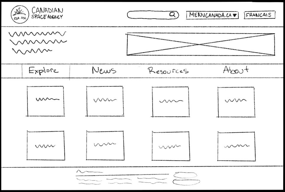
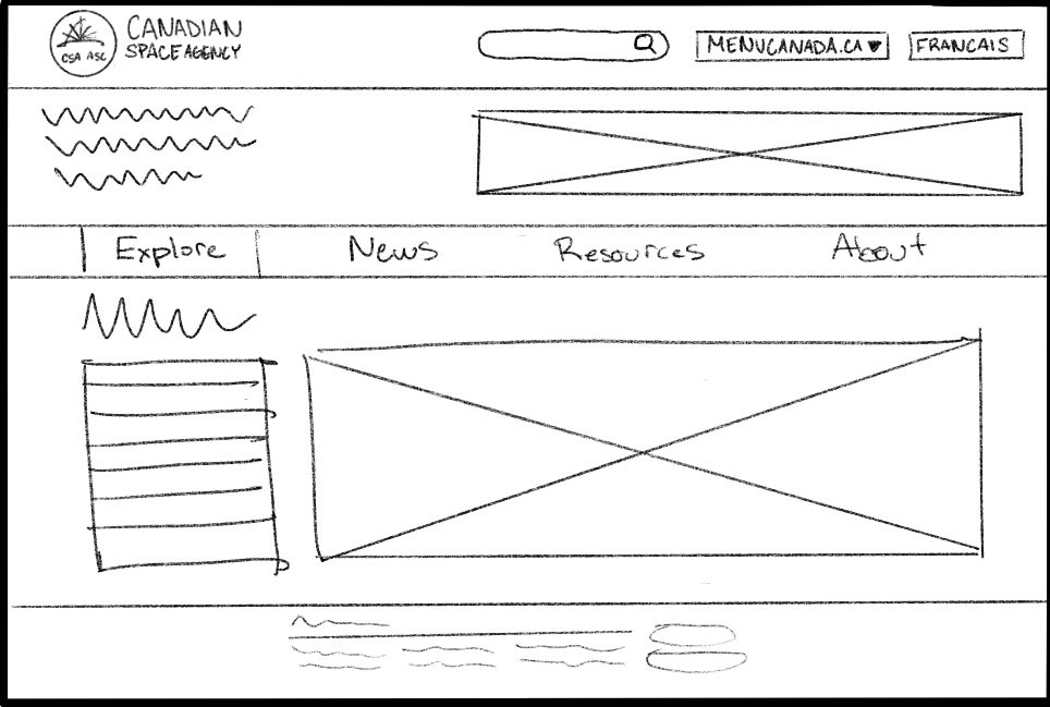
Website Redesign Process - Desktop (Low-Fidelity Sketches, Mid-Fidelity Wireframes, High-Fidelity Prototype)
Website Redesign Process - Mobile (Mid-Fidelity Wireframes, High-Fidelity Prototype)
Tools Used


Problem Statement
The current Canadian government website lacks user engagement and accessibility. Outdated design, complex navigation, and non-compliance with accessibility standards hinder citizens' access to information and services. Redesigning the website is essential to create an inclusive, user-friendly platform that fosters citizen-government interaction, ensures easy information access, and meets modern accessibility requirements.
Objectives & Goals
The objective of this case study is to enhance user engagement, improve accessibility, and provide citizens with a seamless platform to access information and services
User Feedback

Helder
IT Technician
“Overall flow of the site is confusing and non-linear. It's hard to navigate to specific information and sections.”

Zoe
Digital Brand Manager
“Too text heavy. There needs to be more clear cut sections and make better use of icons and colour.”
From this feedback, we conducted a heuristic evaluation to revise the structure of the site and interaction points.
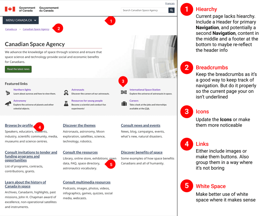
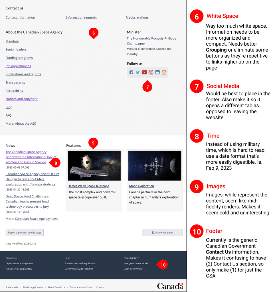
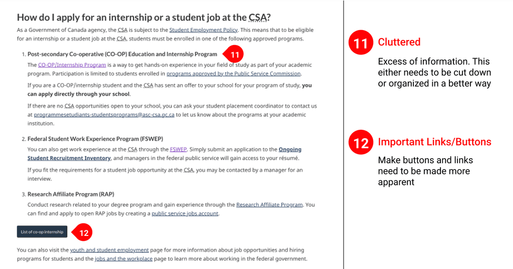

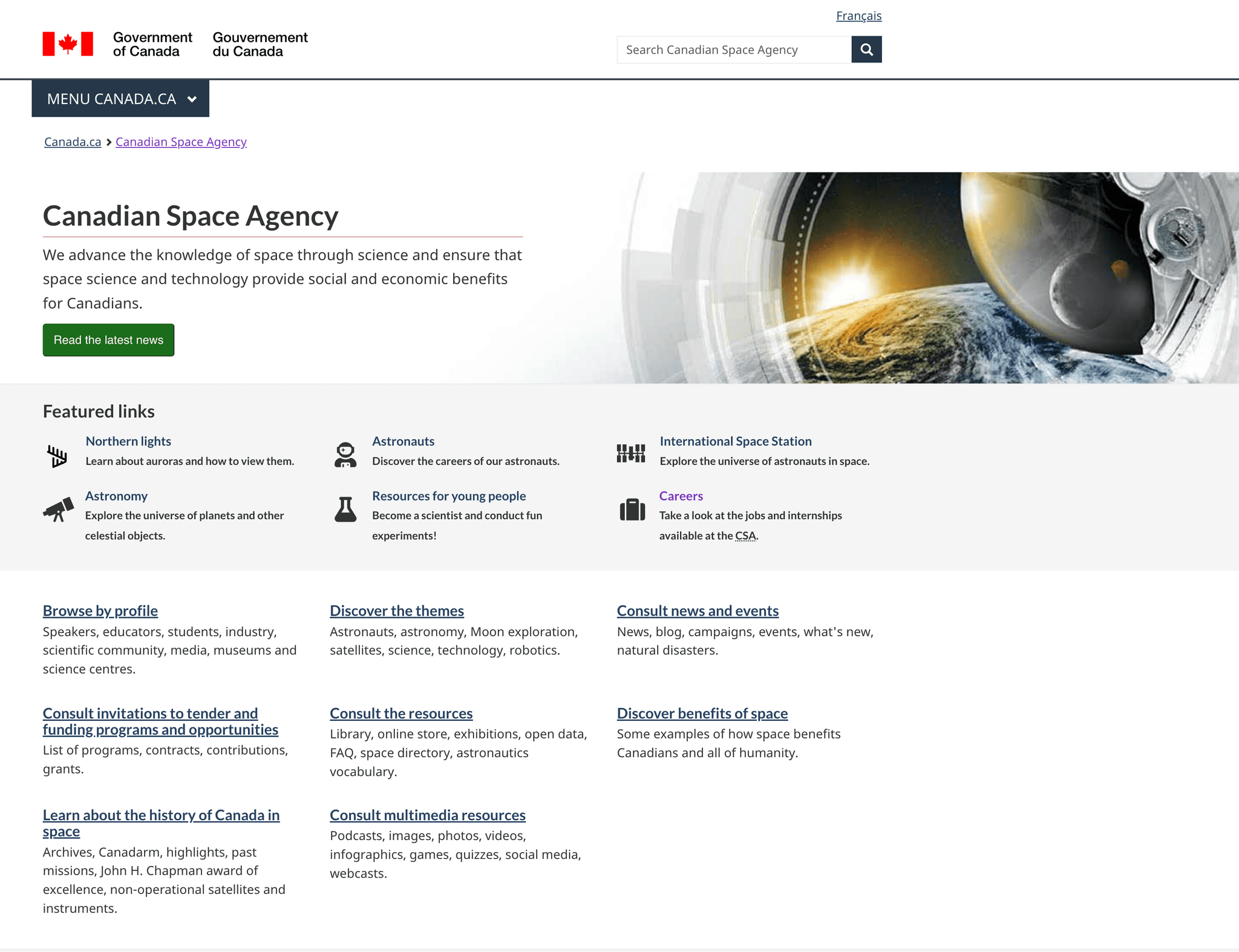
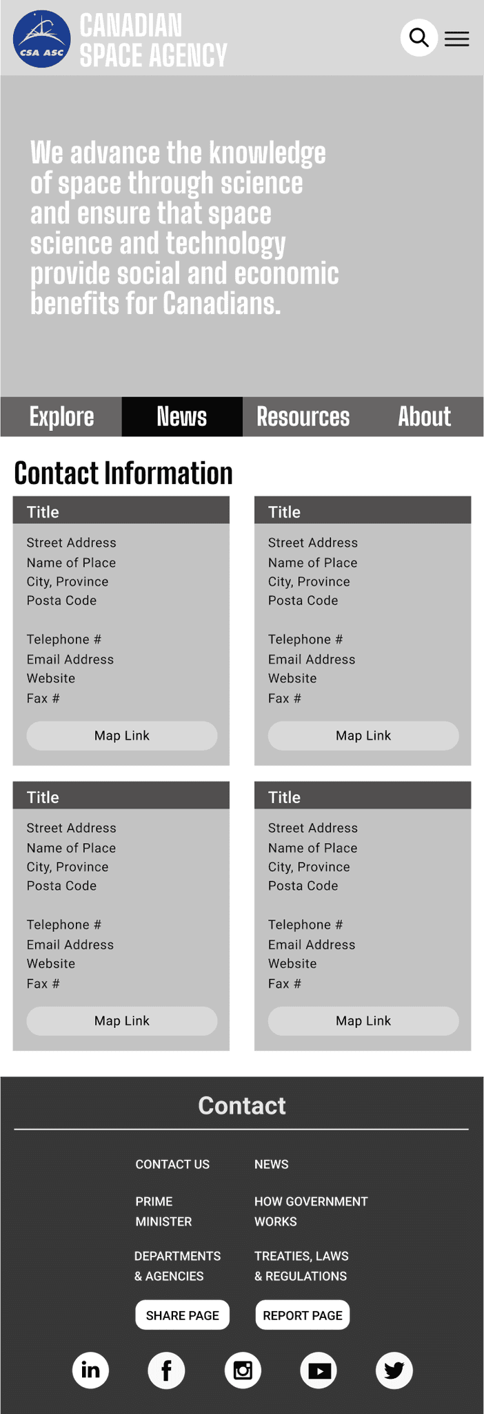
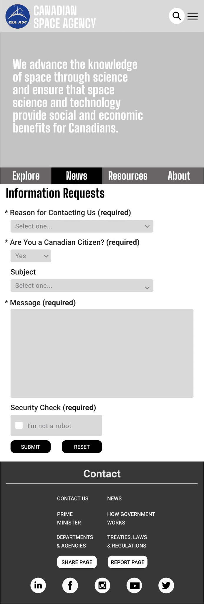
Initial Website Design
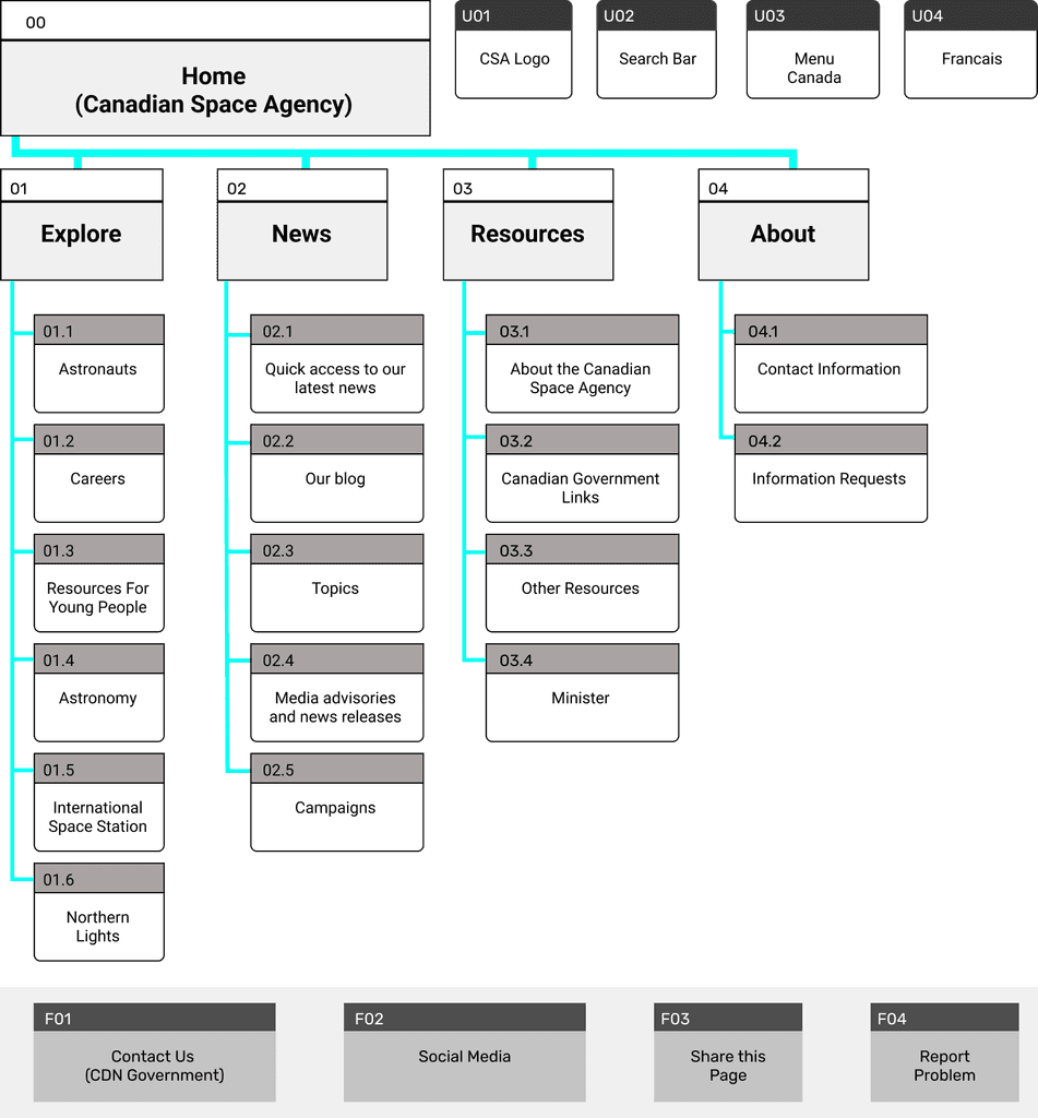
Revised Site Map

Website Redesign Process - Desktop
Low-Fidelity Sketches
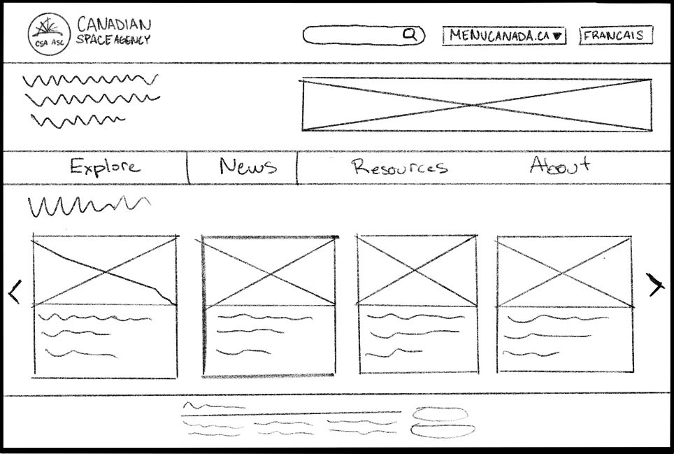
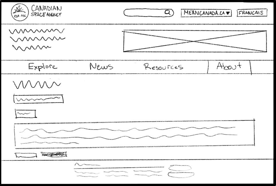
Mid-Fidelity Wireframes
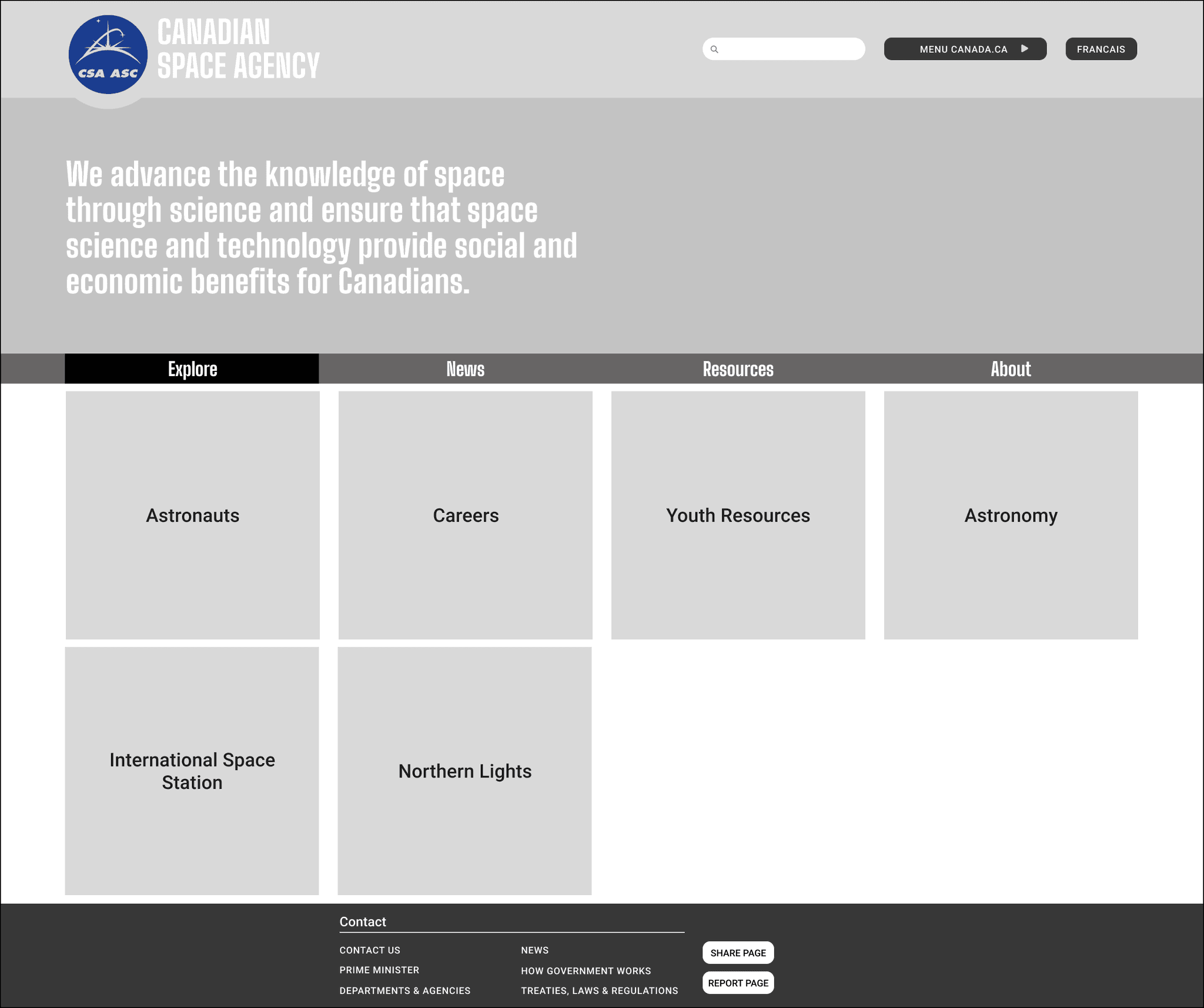
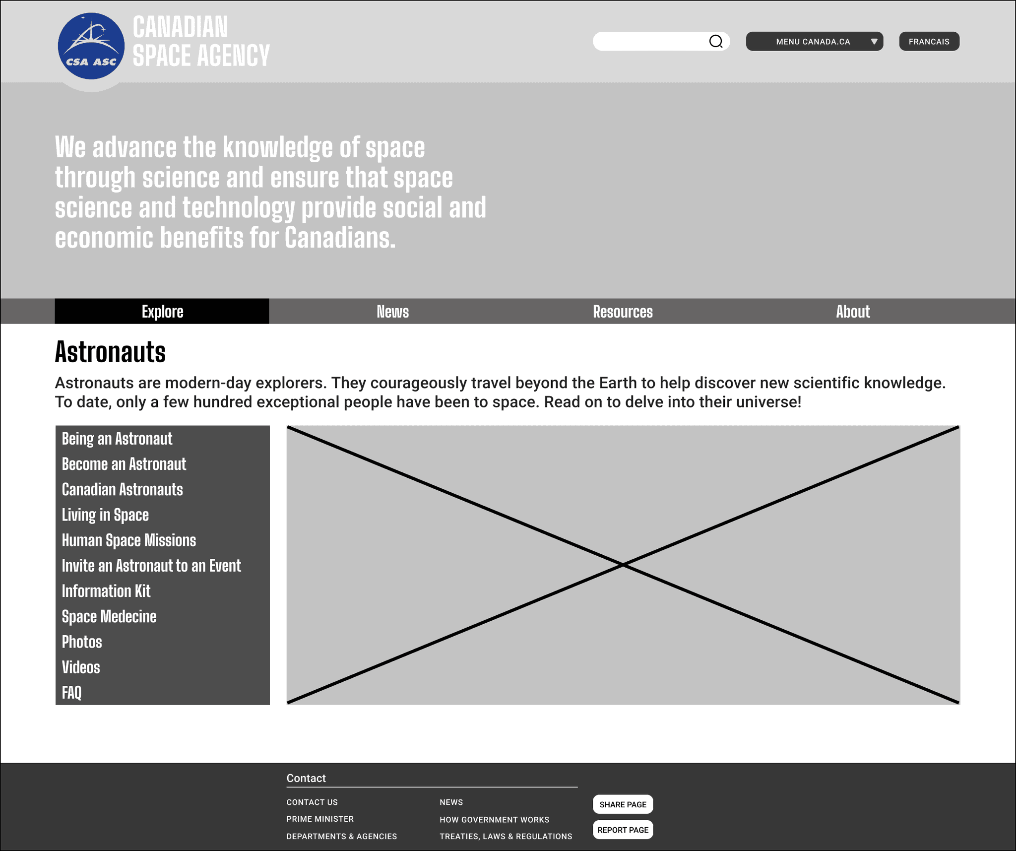
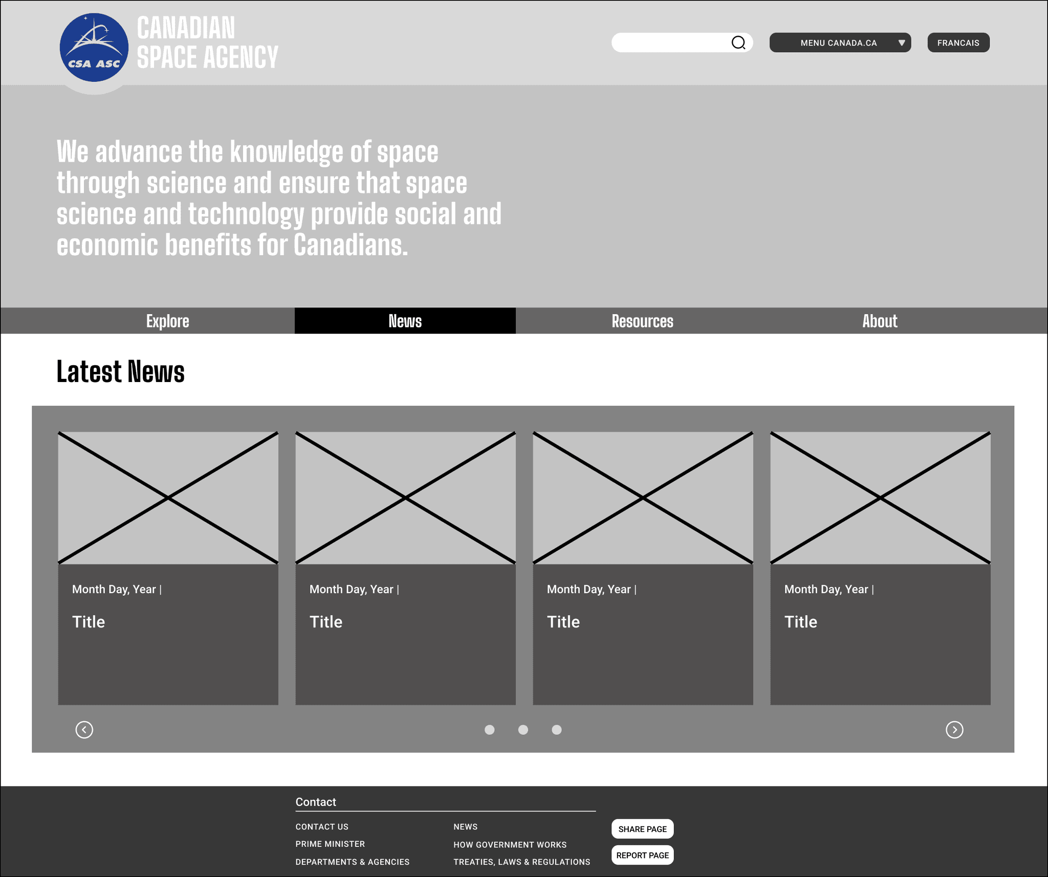
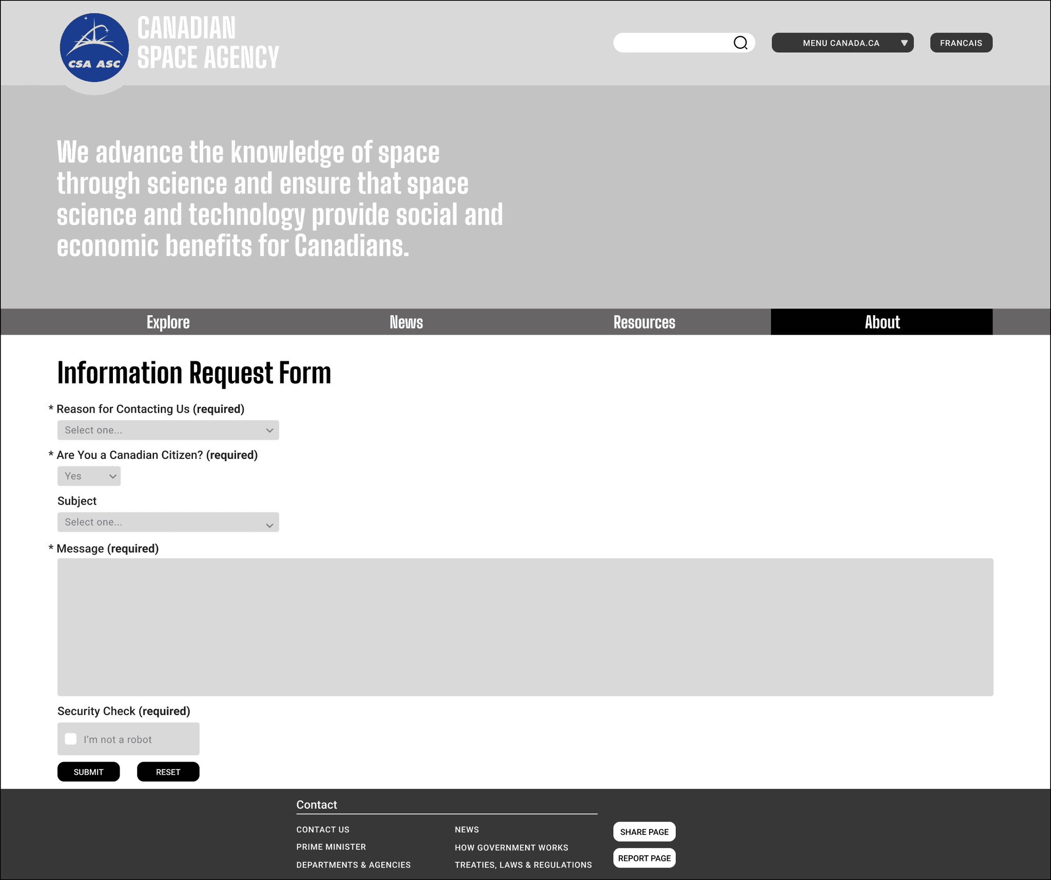
High-Fidelity Prototype
Features and Functions
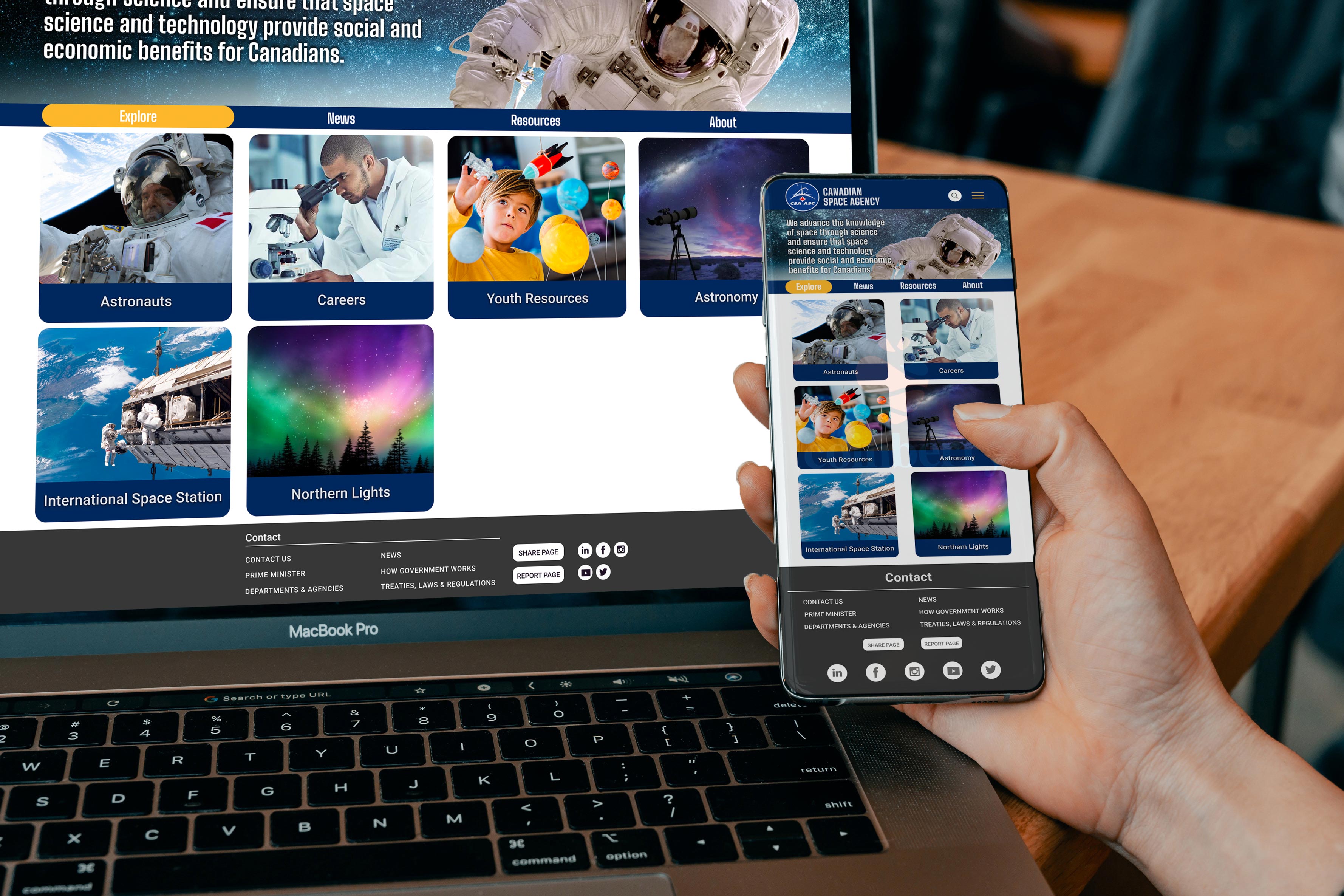
Homepage & Menu


View Figma Prototype (Mobile)
Based on the build and architecture of the Desktop prototype, this was then translated to a responsive mobile version.
Website Redesign Process - Mobile
Mid-Fidelity Wireframes (Mobile)
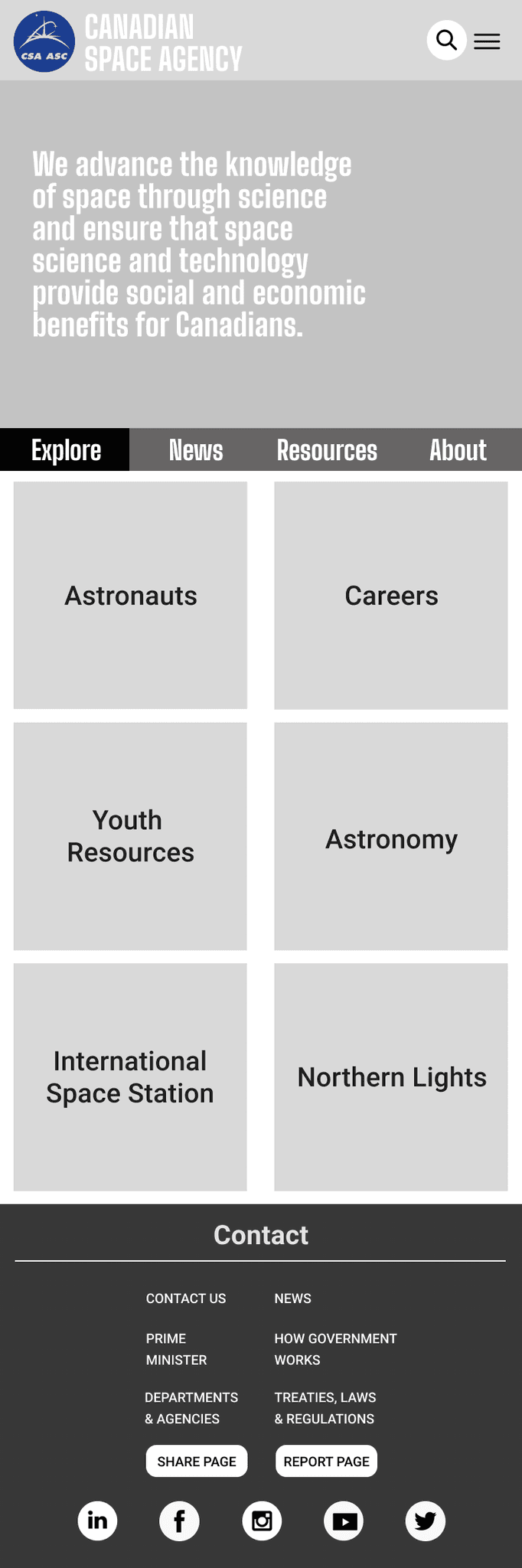
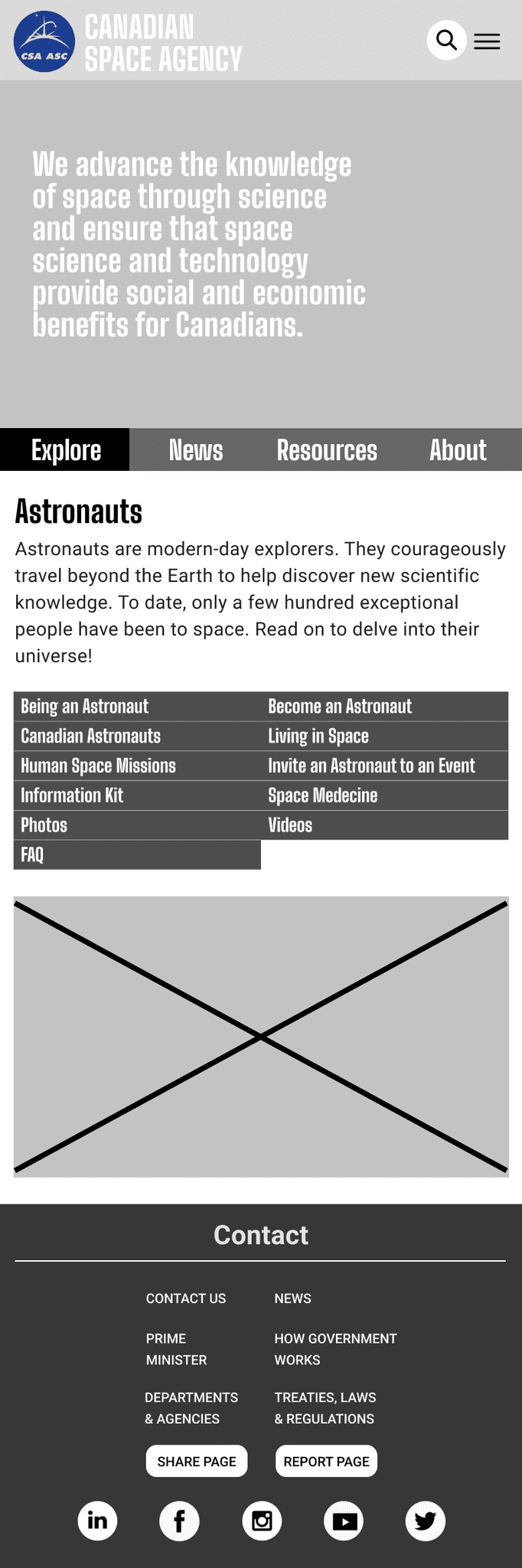
High-Fidelity Prototype (Mobile)
Homepage & Menu

Category Navigation

View Figma Prototype (Mobile)