UX/UI Design
Timeline: 3 weeks
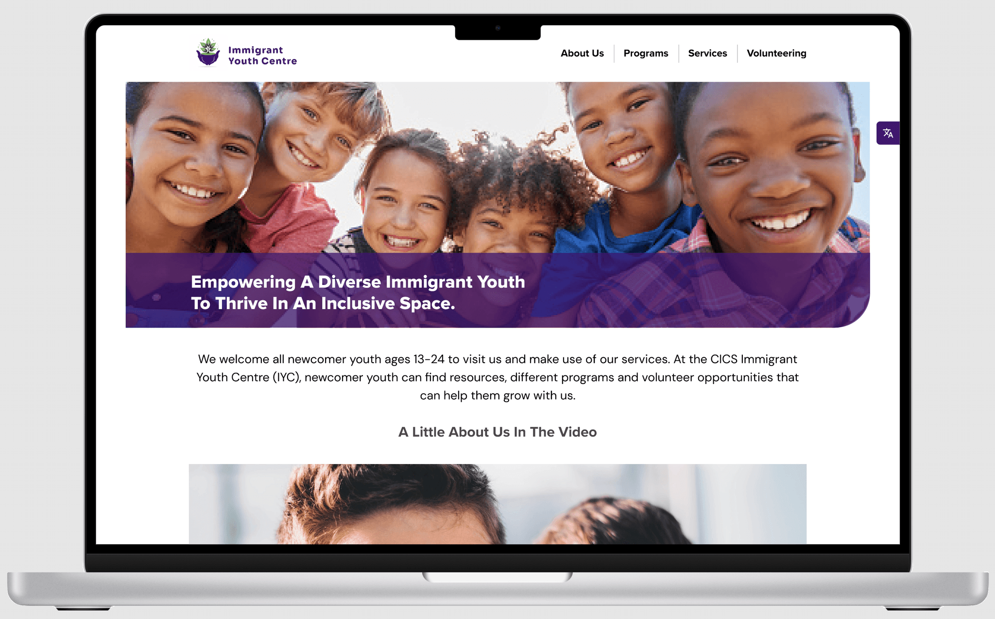
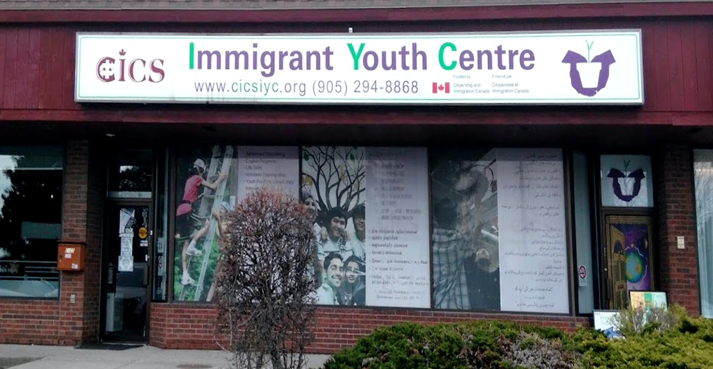
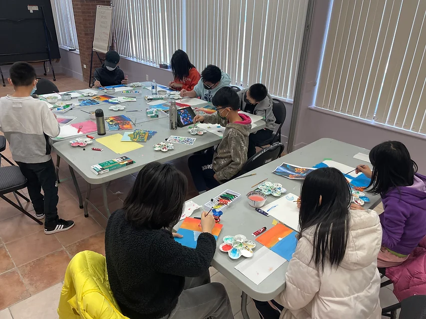
Immigration and acceptance of new people is part of Canada’s identity. Canada is a mosaic country that encourages ethnic groups of all kinds to maintain their distinct cultural roots and values. Our team is looking to redesign the Immigrant Youth Centre website for easier use and understanding for both immigrant youths and immigrant parents, allowing them to enrol in programs built to connect foreigners of similar backgrounds to help their adjustment into Canada. These programs also offer many activities that could help build friendships, build their confidence, and be successful in a new environment.
Directory
Problem Statement | Objectives & Goals | User Interviews | Website Heuristic Evaluation
Empathy Map | Pain Points | User Insight | User Story
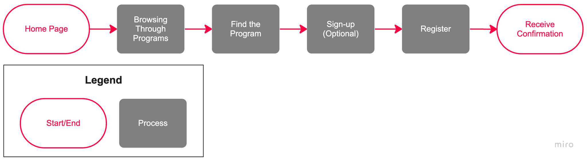
Task Flow Chart
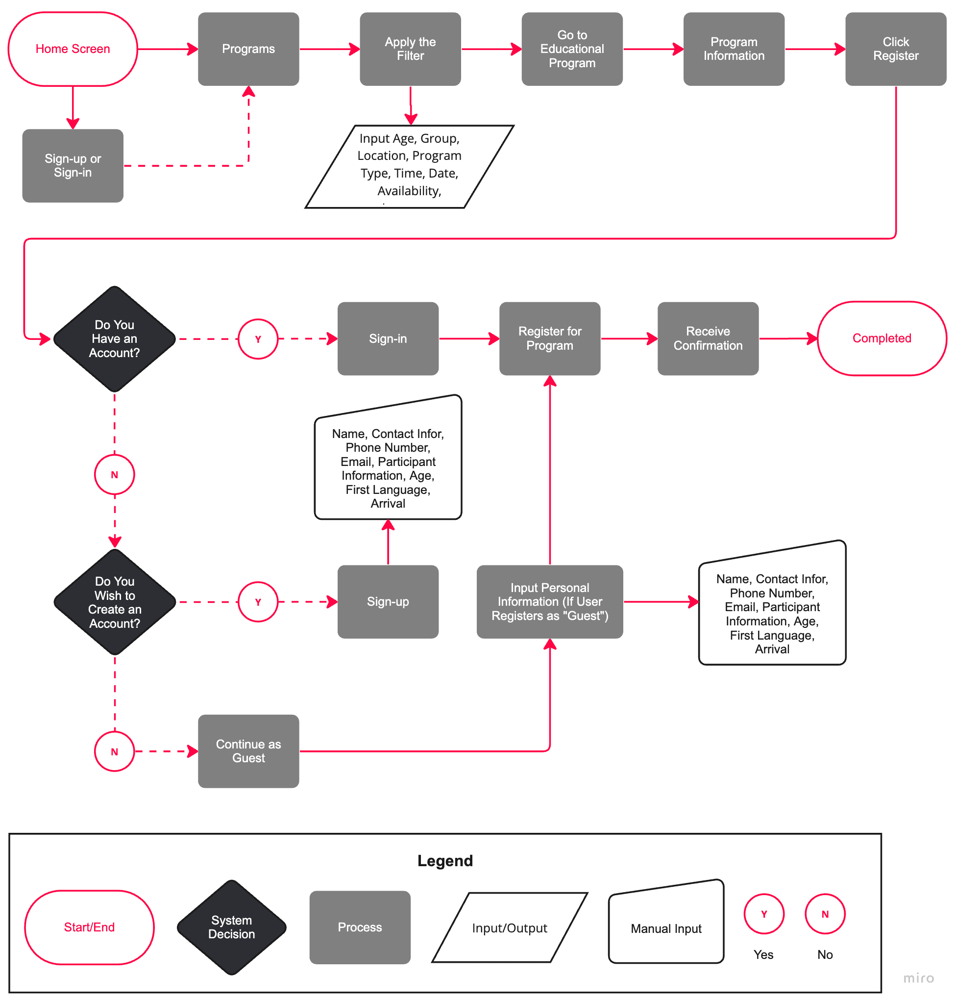
User Flow Chart
Site Map
Tools Used


Group Members + Roles

Adam Lee
Project Manager
UI Designer

Karine
Zahabi
UX Designer

Javad Hakimpanah
UX Designer

Kathy (Ke)
Yan
UX Researcher

Hua Tong
UX Researcher

Problem Statement
Immigrant youths and parents in Canada struggle to find and trust the educational and social support programs on the Immigrant Youth Centre website. We need to improve the communication of program information, build organization credibility, and increase enrolment.
Objectives & Goals
To increase program enrolment and user return, and for users to have more trust in the organization.
User Interviews
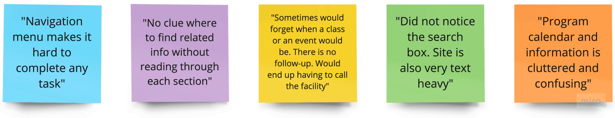
Aside from interviewing the staff, we conducted 25 online surveys and 5 in-person interviews. Through interviewing both immigrant youths and their parents on their pain points with the current website, they said that it was: confusing, unorganized, and cluttered.

Kevin
Program Manager
“We get calls from users inquiring about information that is on the website so we know they are not successfully getting to the details they need”

Yifei
Youth Worker
“Often times, users need to view the content in their native language and shy away from registration because of that blocker.”
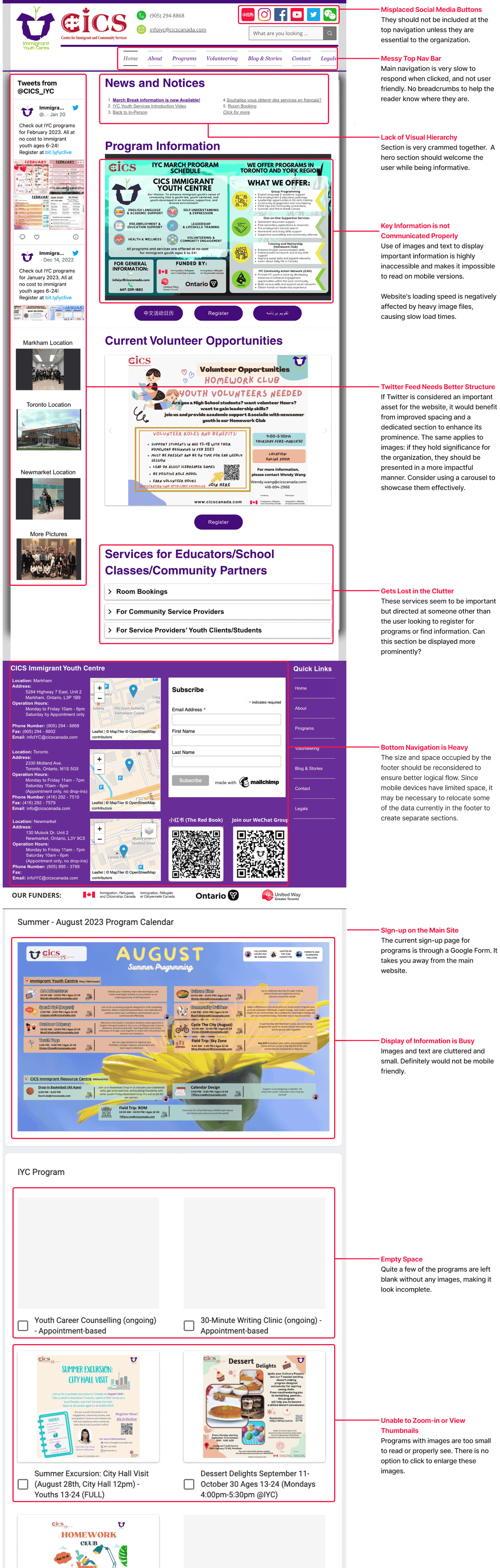
Website Heuristic Evaluation
(Desktop)

Empathy Map
Thinks
"The layout is so primitive and old"
"Why are the pages sliding in when I press the navigation menu?"
"Why the Nav buttons are italic and the font so small?"
"Where am I in the site again? I’m lost. How do I get back?"
"There is too much text on display."
Pain Points
Websites has little info and I often enrol in programs I dislike
Challenging to find open spots in some programs
Finding organizations that could assist and support newcomers was not easy
Online Community was great, but needed more in-person program
User Insight
Immigrant youths and parents, having limited knowledge of the local language and customs, need to feel confident that the programs and resources they seek are credible and beneficial to their success in adapting to Canadian life. They need reassurance that these services will be effective in helping them with their specific needs and that they will be supported throughout the process.
User Story

Age: 40
Gender: Female
Occupation: Accountant
Interests: Golf, Reality TV, Road Trips, Gardening
Goals & Motivation
Having her and her family be part of a community
Her children making new friends
Her children practicing English without judgement
Explore extracurricular activities

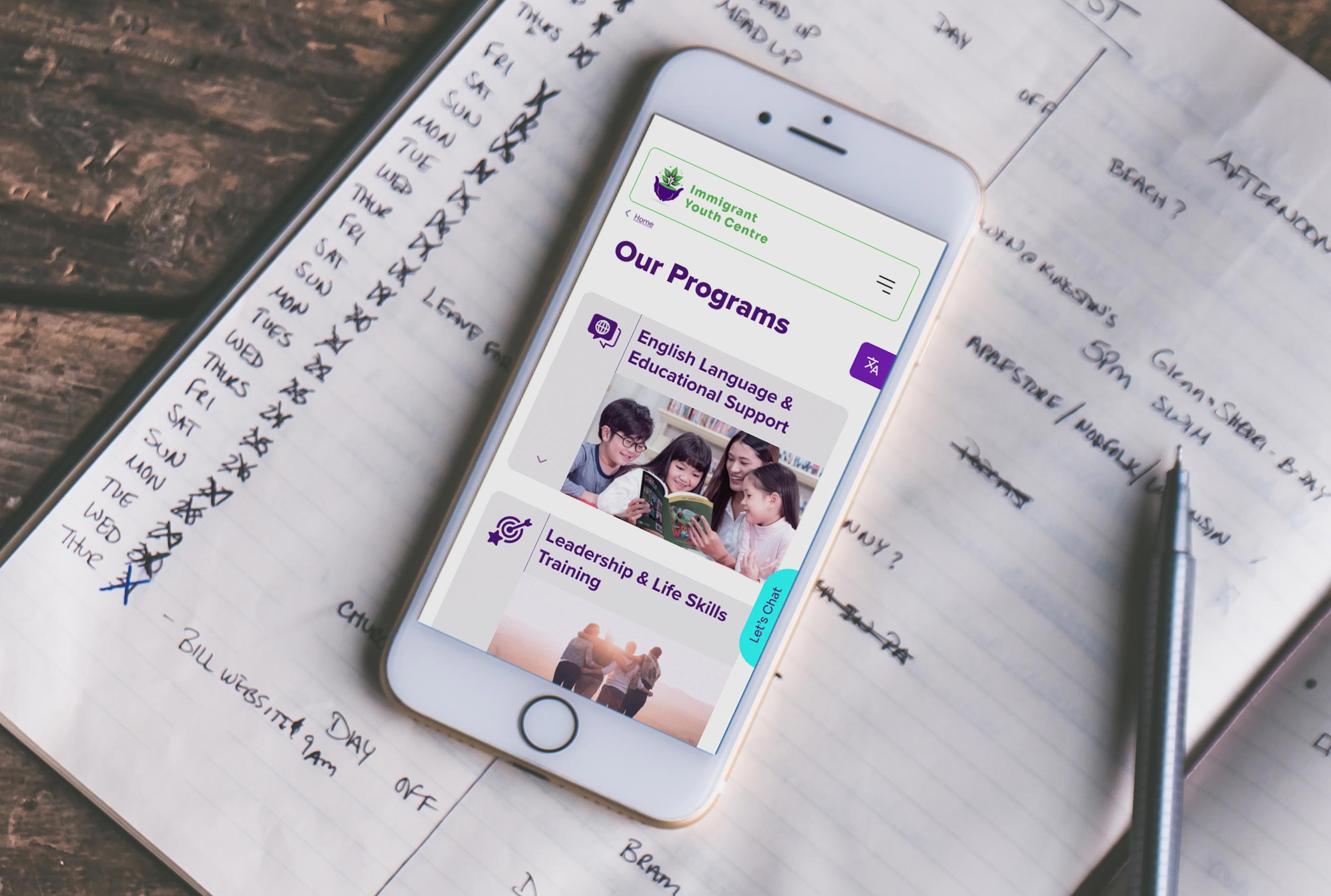
With the data collect, we brainstormed ideas and after some iterations we created a Task Flow and User Flow. Because there currently isn't a mobile version, we placed more focus on mobile, and then desktop.

Mid-Fidelity Wireframes
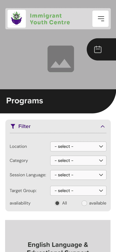
More detailed filters such as: age range, locations, and dates
Adjusted button sizes and other input fields for better usability
A more logical user flow and input fields
High-Fidelity Prototype
Homepage, Menu & Settings

Program Search, Filters & Enrolment (Mobile)

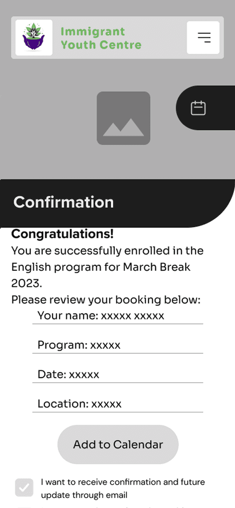
Confirmation, Calendar, Text & Email Follow-up (Mobile)

View Figma Prototype (Mobile)